01 / UX Research / Information Architecture
DH@UofT Redesign
Reorganizing a digital humanities website around the tasks of discovering events, finding collaborators and accessing research opportunities, through research, information architecture and prototype testing.
From organizational information to user tasks
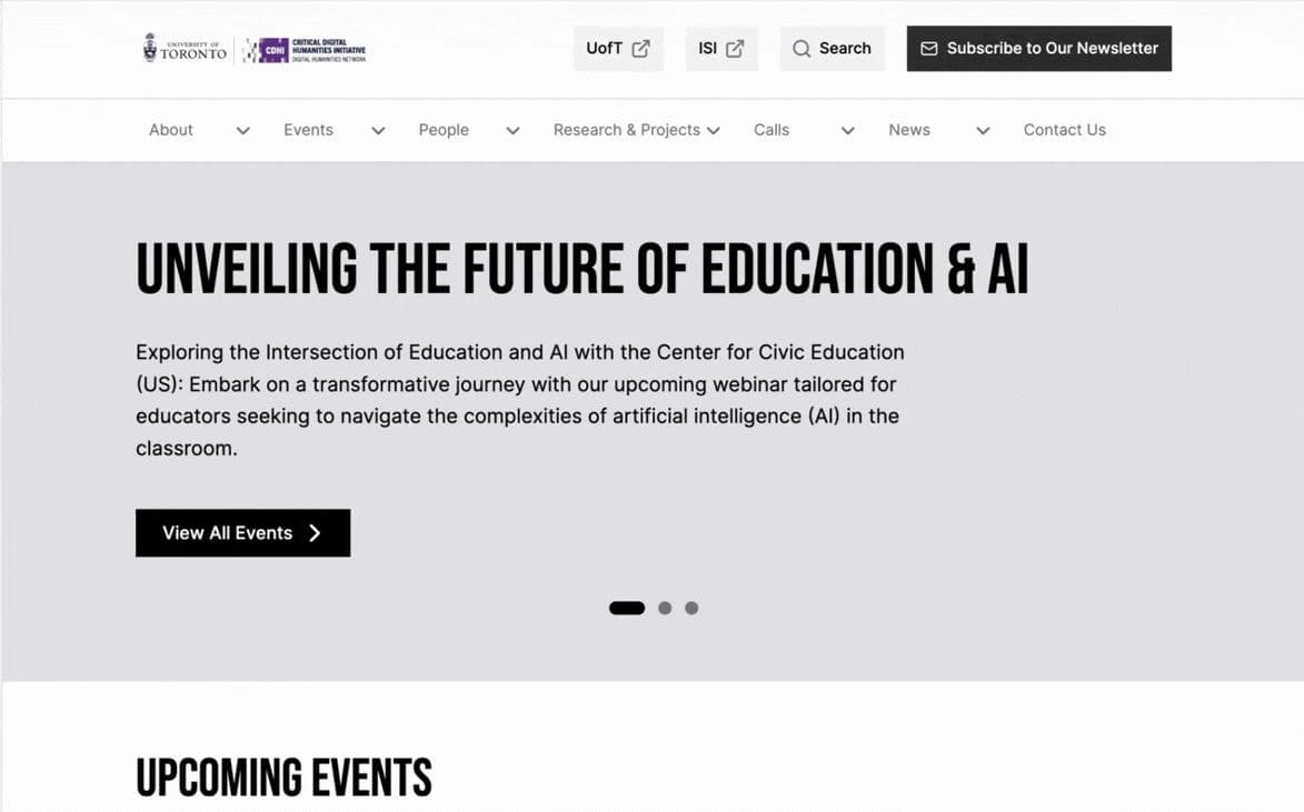
The team’s playback identifies a site that explained the organization more readily than it helped visitors act. Overlapping category labels, mixed current and older material, and unstructured content growth made it difficult to understand where to go and what was current.
The midterm problem statement frames the challenge as moving from documenting organizational history to providing clear, task-oriented information. Event publishing and long-term maintainability mattered: the stakeholder analysis described a small operational team without dedicated web or UX support.
The redesign combines clearer information architecture with more explicit actions and stronger connections between people and research. The documented output is a desktop prototype and design recommendations; implementation and evaluation of a live site are listed as future work.
My contribution
My work centred on competitor analysis, SWOT comparison, participating in client interviews and taking notes alongside another team interviewer, and collecting and organizing interview notes for affinity mapping. These contributions connected external benchmarking with stakeholder priorities as our team developed its design direction.
The information architecture, prototype and testing results presented in this case study are team outputs. The sections below distinguish my contribution to discovery and synthesis from the broader work of our five-person team.
Competitor analysis & SWOT comparison
I compared the client’s website with three organizations recommended by the client: the Schwartz Reisman Institute for Technology and Society, the Critical Digital Methods Institute, and the Jackman Humanities Institute. These were meaningful comparators within the same ecosystem, reflecting the client’s visual and storytelling preferences.
I examined how each website presented its mission, organized content, communicated opportunities and helped visitors find relevant information. The comparison drew attention to homepage clarity, information hierarchy, labelling, and the visibility of events, initiatives and opportunities for engagement.
The SWOT framework extended the comparison beyond visual and structural features to institutional positioning, communication style and unrealized potential. It gave our team a way to discuss recommendations through specific comparisons rather than broad impressions that the existing site felt unclear.
From client interviews to affinity mapping
I participated in client interviews and took notes alongside another team interviewer. This work involved listening for stated needs as well as priorities and concerns expressed through the conversation.
After the interviews, I helped collect and organize the notes for affinity mapping. Together, we grouped scattered observations into patterns of shared concerns, areas of confusion and opportunities. This helped narrow the design direction around stakeholder input.
This account documents my contribution to the synthesis process. The midterm now supplies discovery themes and proposed directions; the underlying affinity map and observation-level links to individual IA decisions remain unavailable. Client interviews are not assumed to be the same sessions as the six user interviews reported in the playback.
Research focus
How can DH@UofT help visitors find relevant events, research, collaborators and opportunities through a clearer structure, more consistent language and better-connected content?
This question is a case-study synthesis of the project goals and tasks in the playback, rather than a quotation from an original research protocol. The deck frames the goals as task-oriented user flow, updated information and improved usability.
Faculty and PhD researchers are identified as primary audiences. Graduate students, senior undergraduates and visiting scholars are secondary audiences. These intended audiences should not be read as a confirmed recruitment breakdown.
Research process & available evidence
| Activity | What the playback reports | What remains undocumented |
|---|---|---|
| Heuristic evaluation | 12 issues identified. | Evaluation framework, evaluators, issue list and severity ratings. |
| User interviews | 6 interviews reported in the midterm and final decks. | Recruitment, participant profiles, interview guide, session length, consent and interview-specific coding. |
| Card sorting | 6 card sorts; the midterm identifies a closed card sort across Research, News, Events, About, Programs, Learning and Funding. | Full card set, instructions, participant profiles, raw placements and agreement calculation. |
| Discovery-stage task testing | Midterm slide 9 reports N = 4. | Task script, participant profiles and overlap with the final evaluation rounds. |
| Testing overview | The project-progress slide reports 13 across two rounds of usability and A/B testing. | Allocation across rounds, whether this counts sessions or people, and repeat participation. |
| Detailed usability testing | 4 tests, described as involving 2 researchers and 2 faculty participants. | Recruitment criteria, moderator script, assistance rules, success criteria and relationship to the overview total. |
| Detailed comparative testing | 5 A/B tests; 3 use AB order and 2 use BA order, across five tasks. | Participant overlap, assignment procedure, version definitions, task order and raw results. |
Discovery findings → design priorities
| Discovery insight | Reported evidence | Proposed direction |
|---|---|---|
| Deep and overlapping navigation | The IA audit and research synthesis identified overlapping categories and weak support for people and networks as entry points. | Clarify Programs, Events and Learning; connect people with research; separate active opportunities from legacy content. |
| Visitors arrived through other channels | The midterm describes arrivals through Google and newsletters, with internal navigation and search providing limited support for finding information. | Make information understandable beyond the homepage and prioritize pathways to people, workshops and funding. No analytics-based traffic proportions are supplied. |
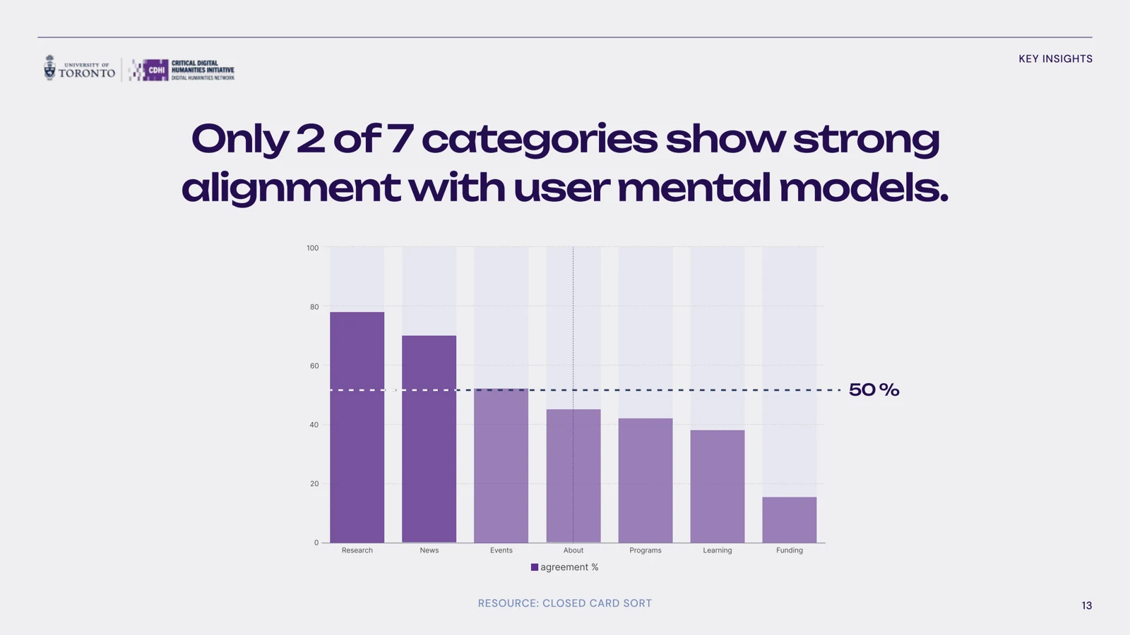
| Labels did not match expectations | The closed card-sort summary describes only 2 of 7 categories as strongly aligned. Research and News rank highest; Funding ranks lowest. The deck reports confusion between funding and resources, and audience-based grouping rather than task-based organization. | Simplify terminology and clarify opportunity categories. Treat the sorting results as a direction for iteration, not proof that a revised structure works. |
| Maintenance was a design constraint | Stakeholder and operational analysis describe a small team without dedicated web or UX support. | Work within existing branding, support event publishing and prevent content accumulation from recreating structural ambiguity. |
Closed card sorting: category alignment
Information architecture changes
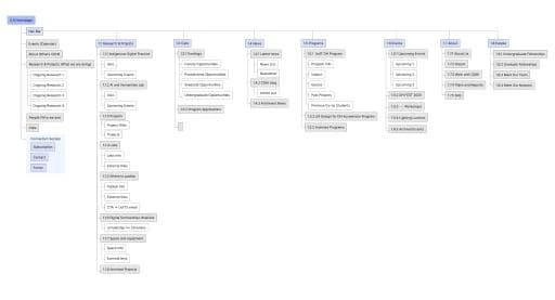
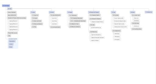
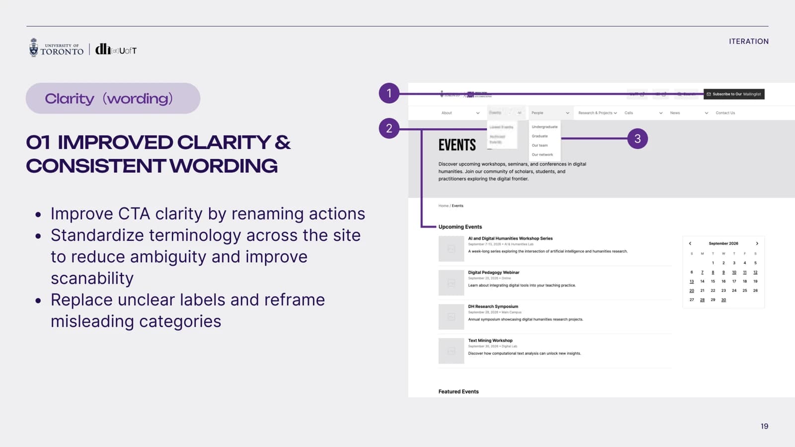
- Clarify the roles of top-level categories so visitors can better anticipate what lies behind a label.
- Separate active content from archive material to make currency easier to judge.
- Shift the homepage toward actions, including finding events, rather than relying mainly on organizational explanation.
- Connect People, Research and Projects, and Labs so collaborator discovery can begin with either a person or an area of research.
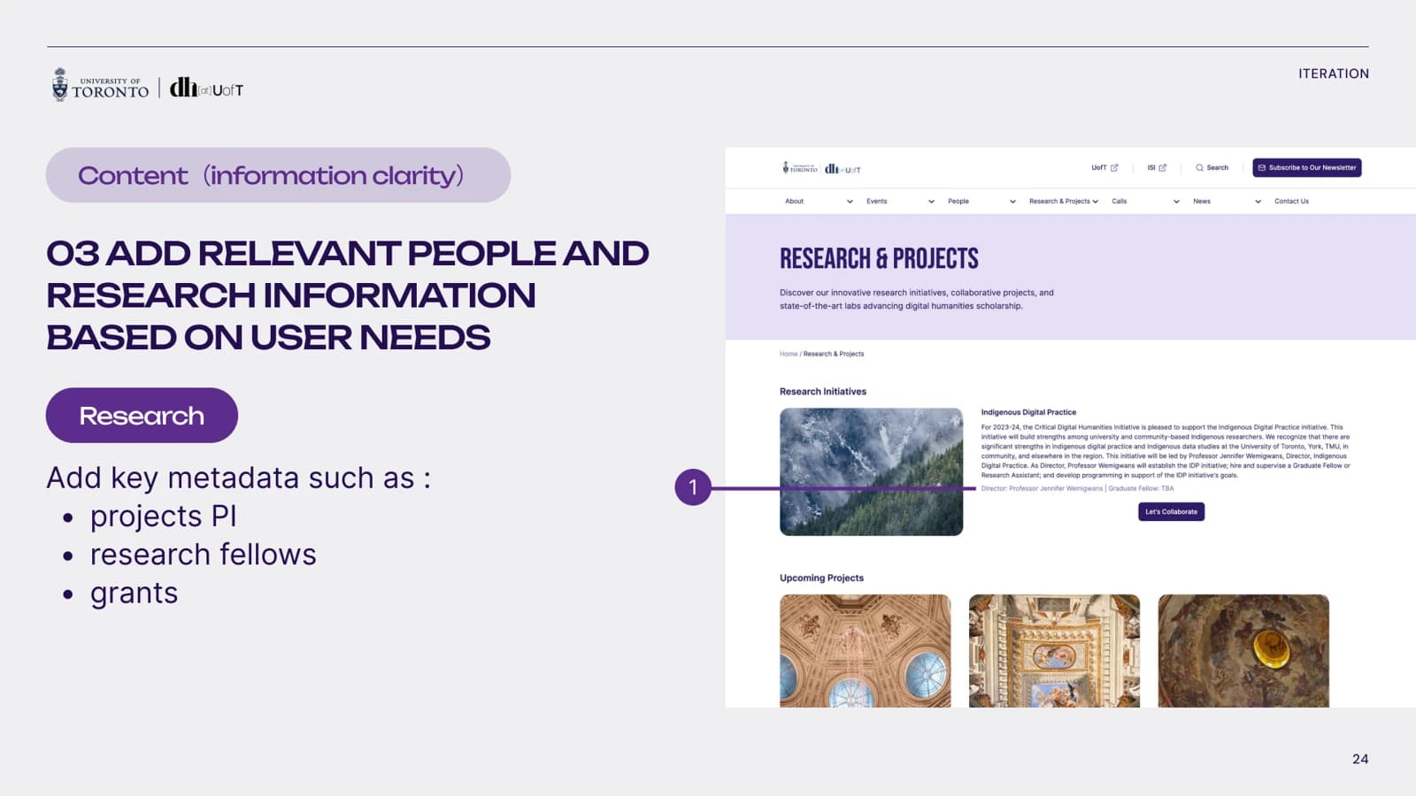
- Add contextual metadata: research fields, contact information, projects and biographies for people; principal investigators, research fellows and grants for research content.
Before & proposed structure
Task-based prototype evaluation
- Find an event.
- Find a research collaborator.
- Find recent projects.
- Apply to fellowships.
- Register for the newsletter.
Testing findings → design response
| Finding | Reported evidence | Design response |
|---|---|---|
| Labels did not reliably predict content. | Participants hesitated over whether “Latest projects” meant ongoing or recently completed work. Newsletter/mailing-list terminology and graduate/undergraduate labels also created ambiguity. | Standardize wording, clarify actions, and distinguish current status from recency. Reframe misleading categories. |
| Collaborator discovery began along different routes. | Some users started with People; others began with Research and Projects or Labs. The expected People-led path did not cover both approaches. | Bridge People and Research/Labs; connect projects with principal investigators, staff and fellows, and expose relevant profile metadata. |
| “Calls” was understood differently across audiences. | The deck reports that academic users recognized the label more readily, while non-academic users overlooked it and used search. The subgroup samples are not fully specified. | Treat terminology as context-dependent and clarify opportunity labels. The deck does not establish a fully resolved, retested replacement for “Calls.” |
Reported usability evidence
| Measure | Reported result | Interpretation / limitation |
|---|---|---|
| Task completion (slide 11) | Summary: current site 18/25 (72%); proposed prototype 22/25 (88%). | The current-site chart appears to show 100%, 100%, 40%, 40%, 100%, equivalent to 19/25 (76%) across five attempts per task. This conflicts with 18/25. Confirm raw results before claiming an overall improvement. |
| Completion time (slide 12) | Reported changes for tasks 1–5: −18.4s, −24.0s, −3.2s, +26.8s, −2.6s. | Four tasks are reported as faster; the fellowship task is slower. The timing aggregation and handling of failed tasks are not documented. |
| Fellowship task trade-off (slides 11–15) | Task 4 is shown as 40% → 60% completion, with a reported +26.8s completion-time change. | Higher reported completion did not coincide with a faster task. Small-sample evidence supports further investigation, not a general performance claim. |
| Perceived difficulty (slides 16, 27–28) | Ratings labelled SEQ: current site 3.6/5; revised prototype 1.6/5, interpreted by the deck as lower difficulty. | Question wording, anchors, coding and respondent-level data are missing. Slide 16 also cites “Closed card sort,” which does not match the displayed metric. Do not infer a standardized SEQ result or repeat “2× easier” / “56% improvement” as validated claims. |
Selected design iterations
Output & next steps
The documented output is a revised desktop prototype, proposed information architecture and recommendations for clearer language and richer contextual information. The playback lists implementation, content migration, maintenance, evaluation of the real site and future feature growth as next steps. It does not establish that the redesign launched.
Reflection
I see this project as more than a course assignment: it reflects how I approach UX work through structure, evidence, collaboration and self-reflection. Comparative analysis helped me frame design opportunities, while client interviews and affinity mapping kept those opportunities connected to stakeholder priorities.
In my assessment, benchmarking and SWOT comparison made our recommendations more strategic and easier to justify. This is a reflection on the value of my contribution, rather than a measured claim about partner impact. The project reinforced the importance of moving from observations to shared patterns before making design decisions.