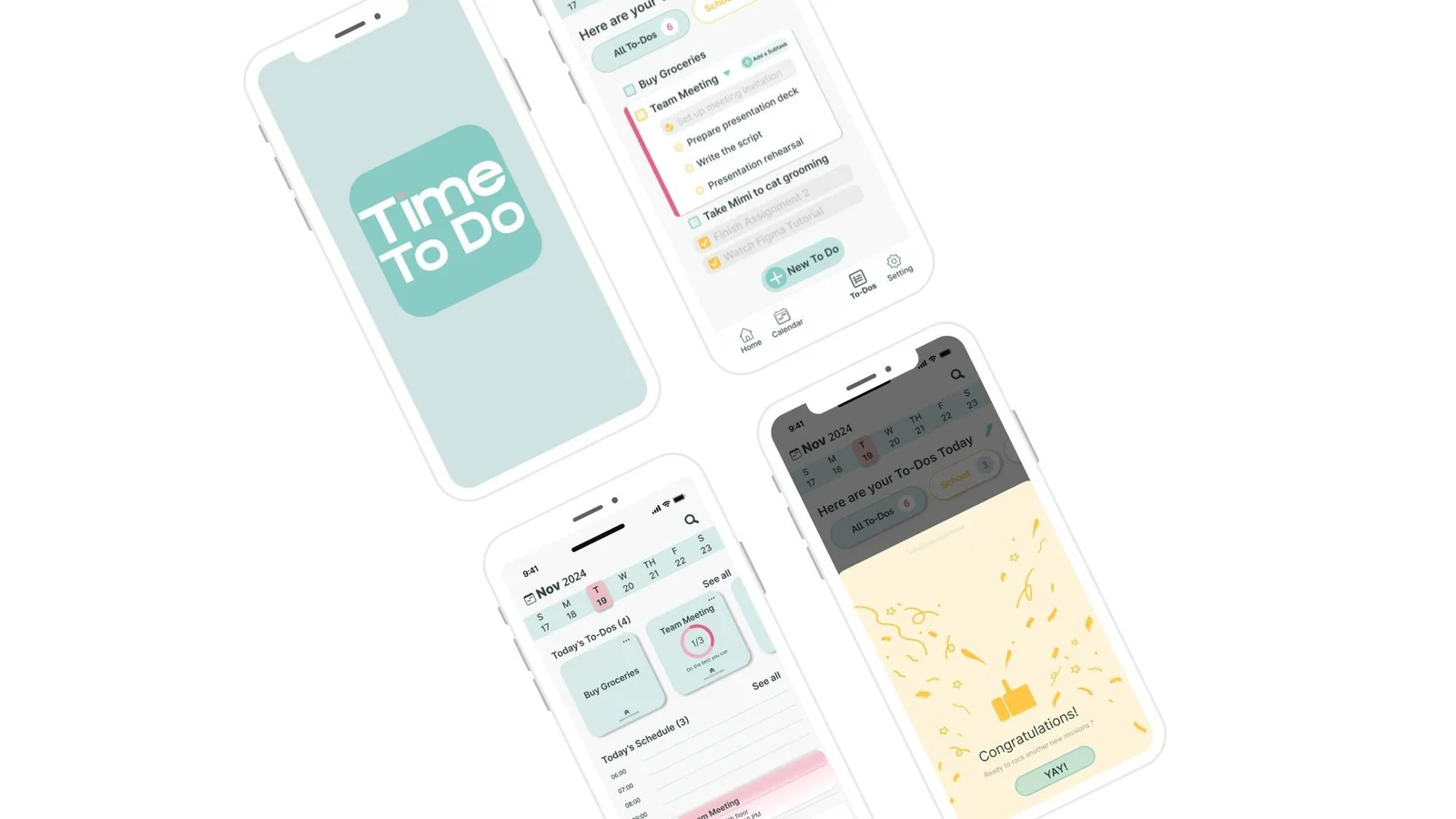
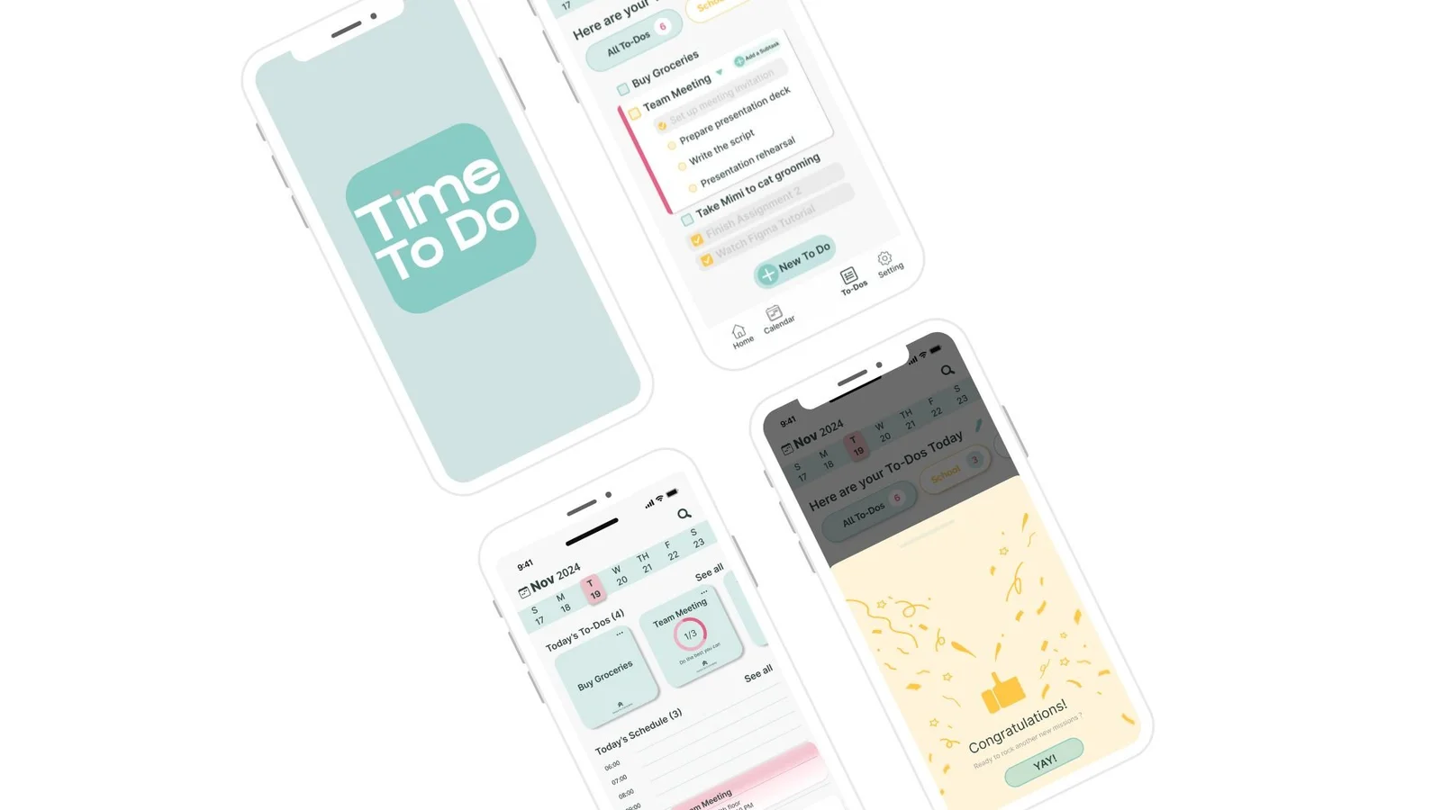
A task-and-calendar app concept exploring how students and working professionals can plan, organize and complete everyday activities.
App concept
Team & my contribution
Stella Huang · Linda Jiang · Xinxin Li · Chloe Yuan
Conducted two user interviews, gathered usability feedback from three participants and synthesized insights.
Contributed to background research, stakeholder and competitor analysis, personas and journey maps.
Led ideation and wireframing studio work, supported team collaboration in Figma, and contributed to interface iteration and the final task flow.
01 / Research & context
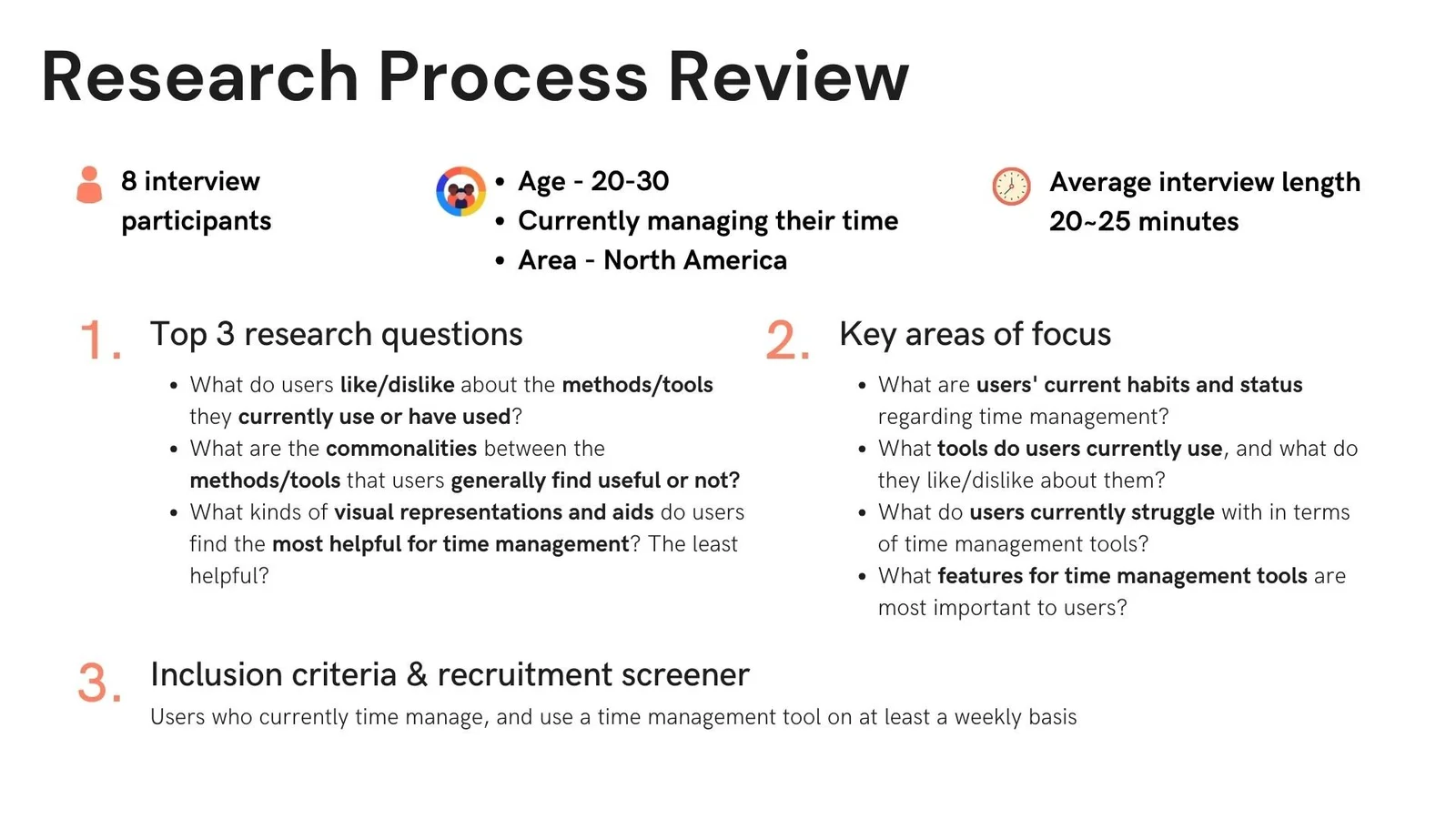
The team investigated how students and working professionals manage tasks across lists and calendars. The original case study reports eight interview participants, supported by stakeholder and competitor analysis.
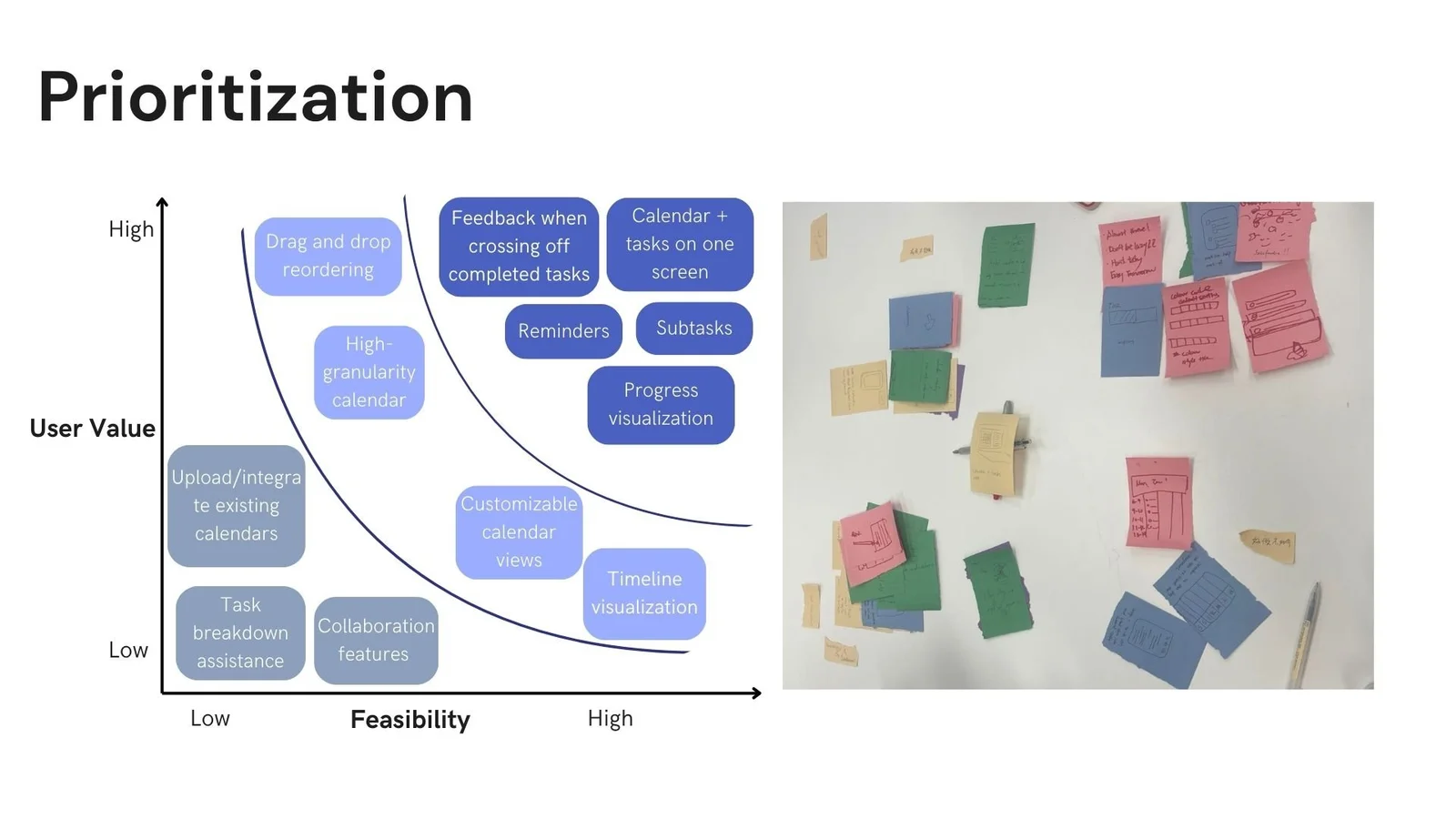
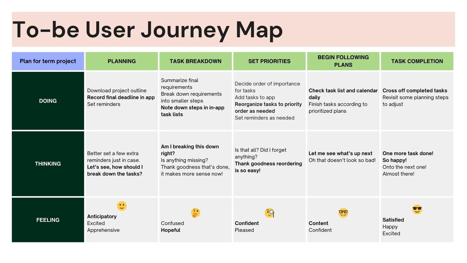
Profiles, a persona and an existing journey map helped organize the research. Prioritization and a proposed journey then framed a combined task-and-calendar experience, with simple task entry and satisfying completion feedback as design goals.
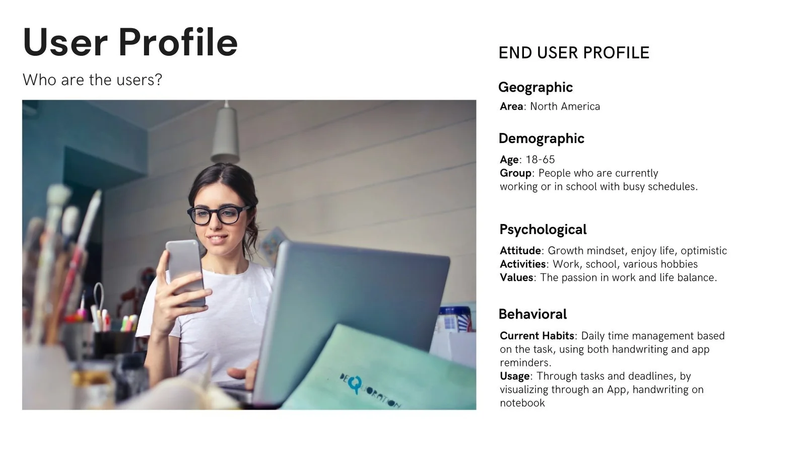
User profileResearch personaCurrent journeyFeature prioritizationProposed journey
03 / Wireframes & task flow
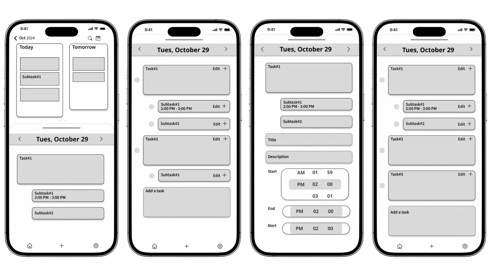
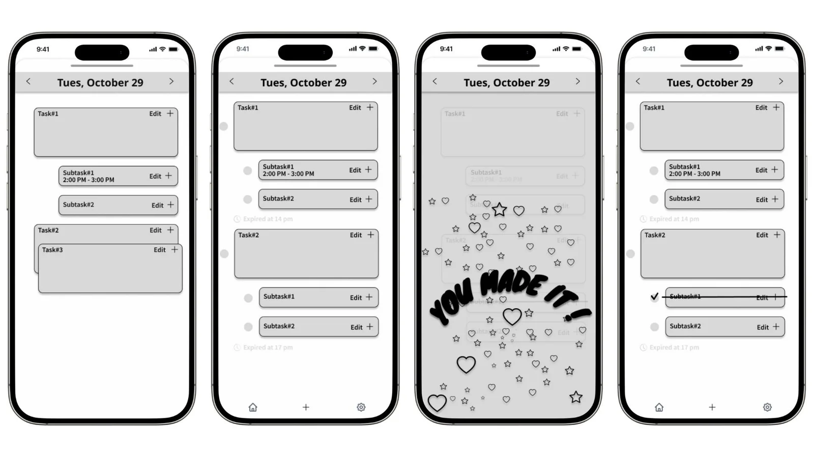
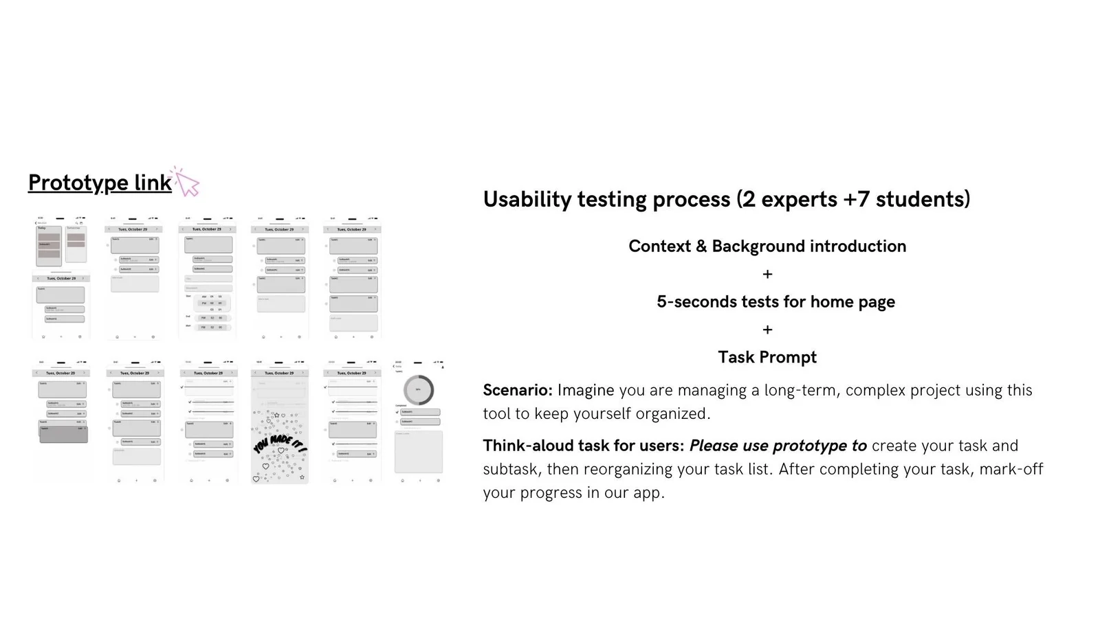
Low-fidelity screens explored the core sequence of planning, adding and completing tasks before visual refinement.
Initial wireframesCompletion wireframes
04 / Testing & iteration
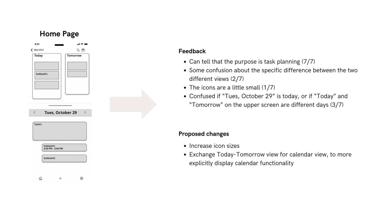
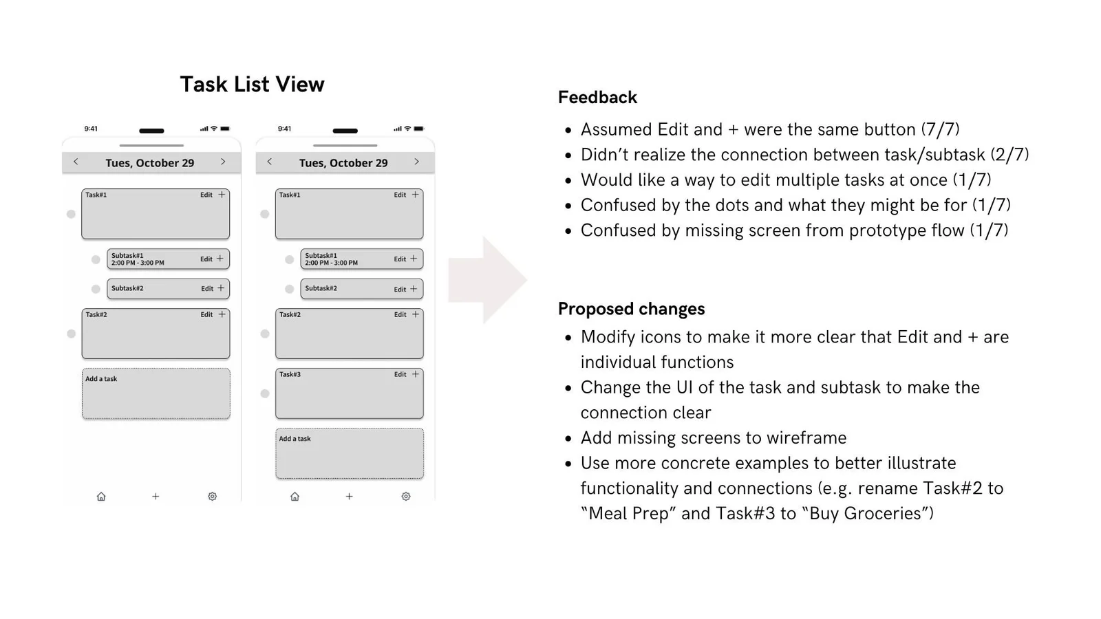
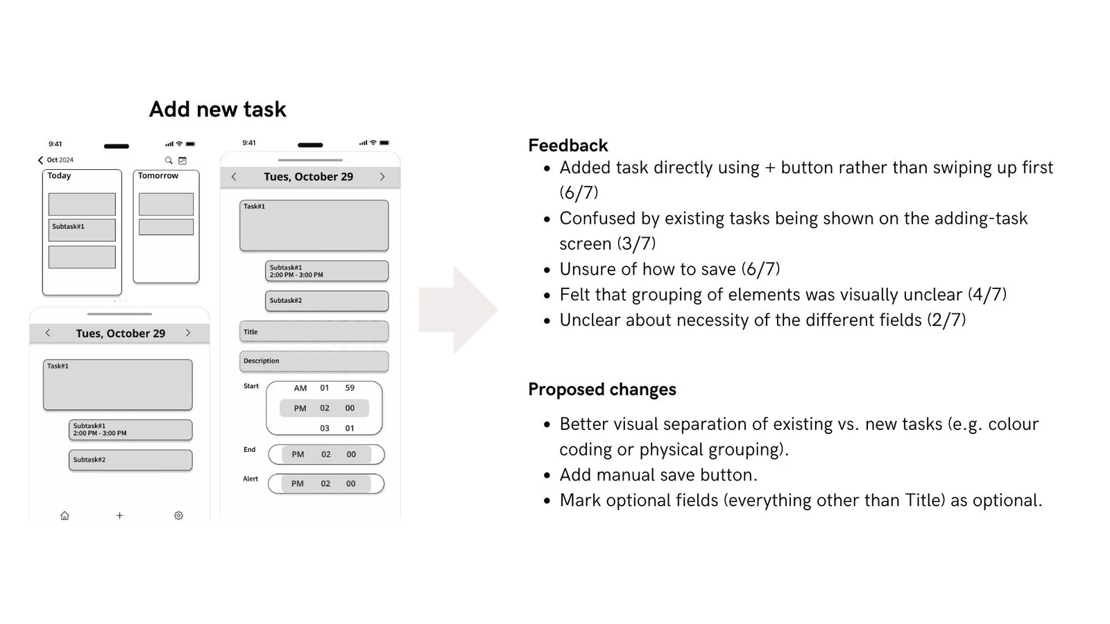
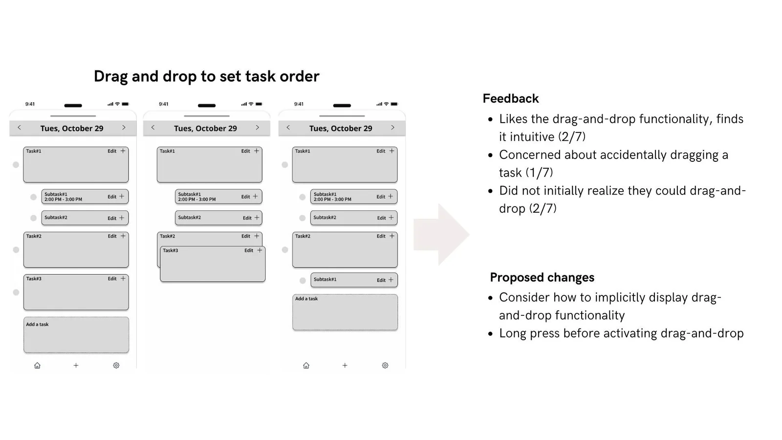
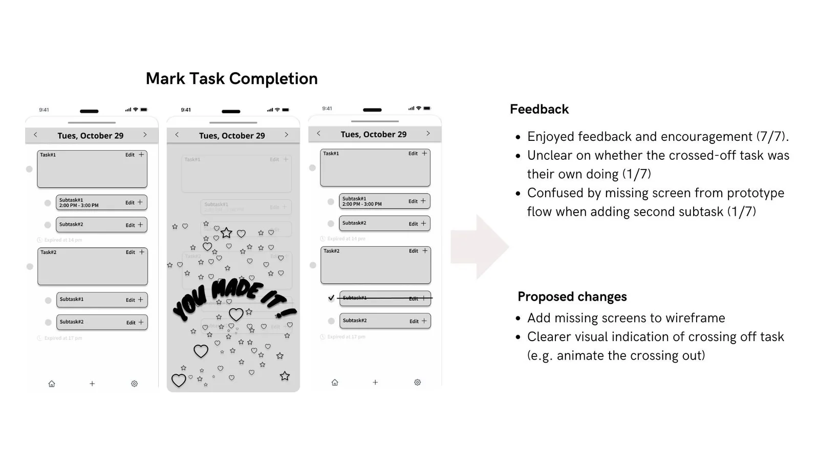
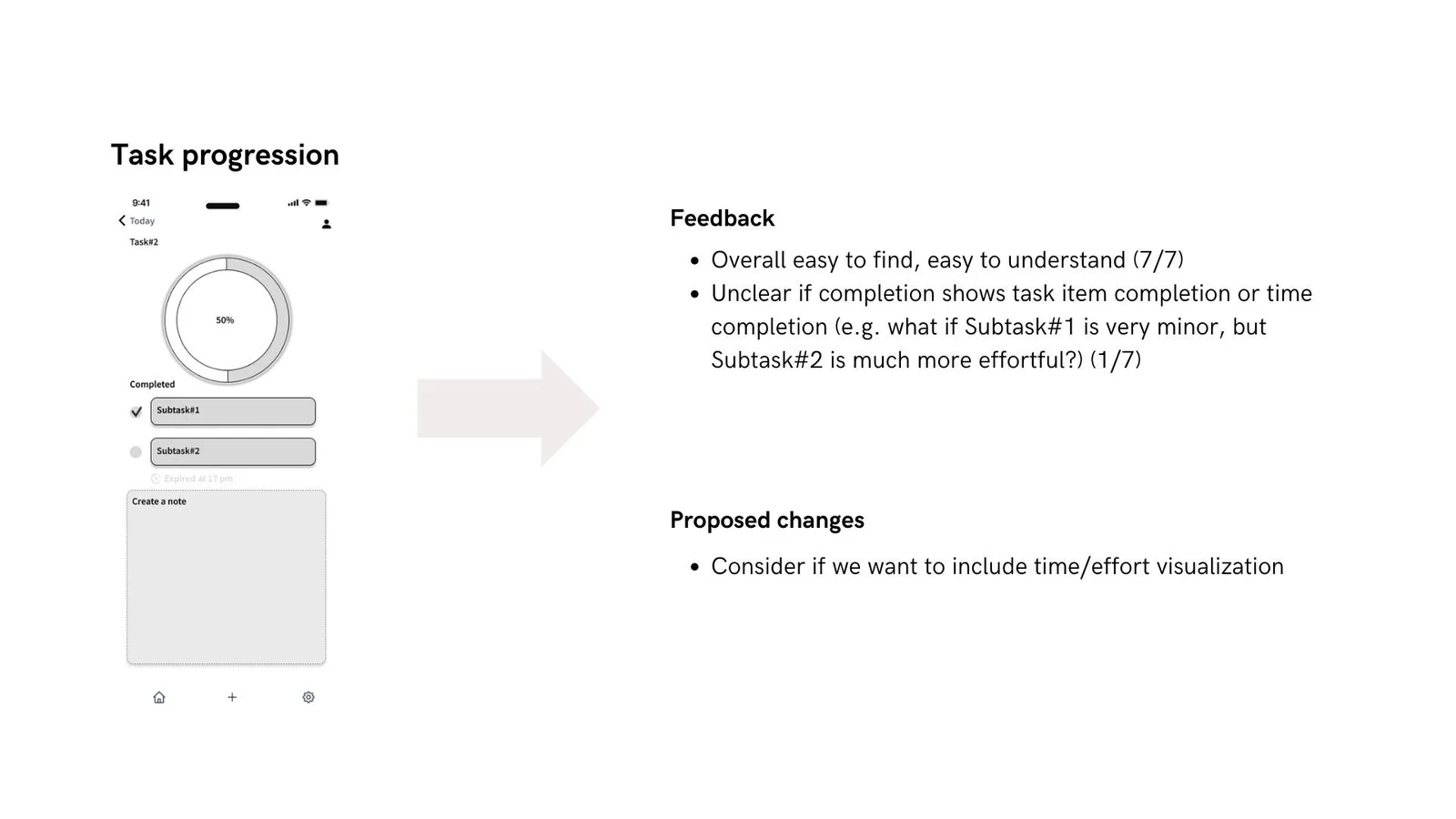
The case study reports usability feedback from seven participants. The boards below pair observations with proposed changes to the home page, task list, task entry, reordering, completion and progress display. These records describe formative feedback; they do not establish measured improvements in productivity or well-being.
Time constraints limited the developed flow to basic task creation and completion. More complex features remained directions for further development. The project reinforced the importance of collaborative synthesis and balancing feature ambition with a feasible scope.
Original project text & additional presentation
Time To Do
Our Time To Do App is an integrated system for task management and a calendar makes the planning of activities easier to realize, particularly for busy working professionals and students.
Project Summary
Problem:
Working professionals and students are not able to plan and carry out their work in a much more productive way and personal satisfaction using separate task lists and a calendar tool.
Solution:
Our app focuses on how to make working professionals and students achieve goals of effective planning, tracking, and completion of tasks in order to maintain a heightening level of accomplishment and well-being. This project specifically looks to address this disconnection between task management and time scheduling by bringing these functions together in a natural and intuitively friendly way that reduces cognitive load on the user.
Success will be measured not only in terms of task completion rates but also in users' reported satisfaction and fulfillment, recognizing that effective time management is not merely about getting things done but about feeling good about how they are done.
Our Team:
Stella Huang Linda Jiang Xinxin Li Chloe Yuan
My Role:
Work on Background research with research questions to achieve more insight for group to use.
I conducted Interviews with 2 participants, gather feedback for usability testing with 3 participants, and summarized insights.
I contribute for research and diagram edit on Stakeholders, Persona and Competitors, gaps, and opportunities, User Journey Map, To-be User Journey Map.
As studio lead for Ideation, I helps teams to collbrated and decide for Prioritization to achieve our design path.
As studio lead for Wireframing & Figma stage to collebrated with my teammates for mutiple design ideations, Layouts and help my teammates to learn and familier in Figma.
Contribuite on Iteration for our app and I improved UI redesign for multiple interfaces.
Contribuite on Final User Journey map, Happy path design and consideration on the logic go through when user to experiences on our wiraframe.
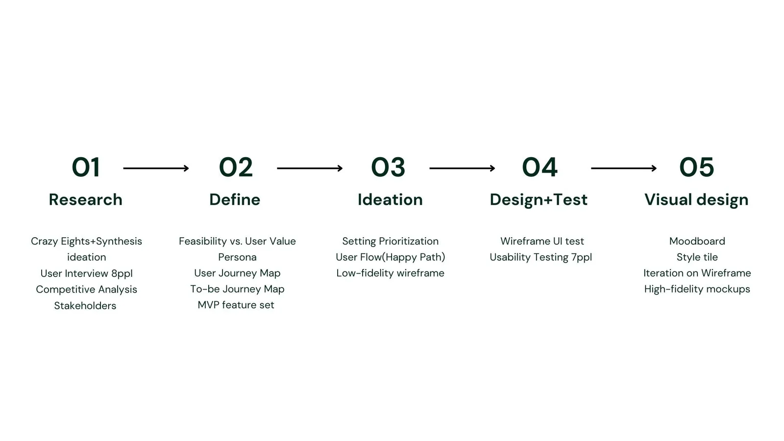
Overview of Project Stages
This project followed comprehensive user-centered design to develop an integrated task and calendar management solution.
We systematically did Research, Define, Ideations, Design+Test, Visual Iteration to actually help working professionals and students manage their time and tasks better.
Project Stages
Research
Our initial research phase focused on gathering comprehensive user insights and market understanding through:
Crazy Eights(Time limit ideation) exercises followed by synthesis of key concepts.
In-depth user interviews with 8 participants to understand time management
pain points and needs.
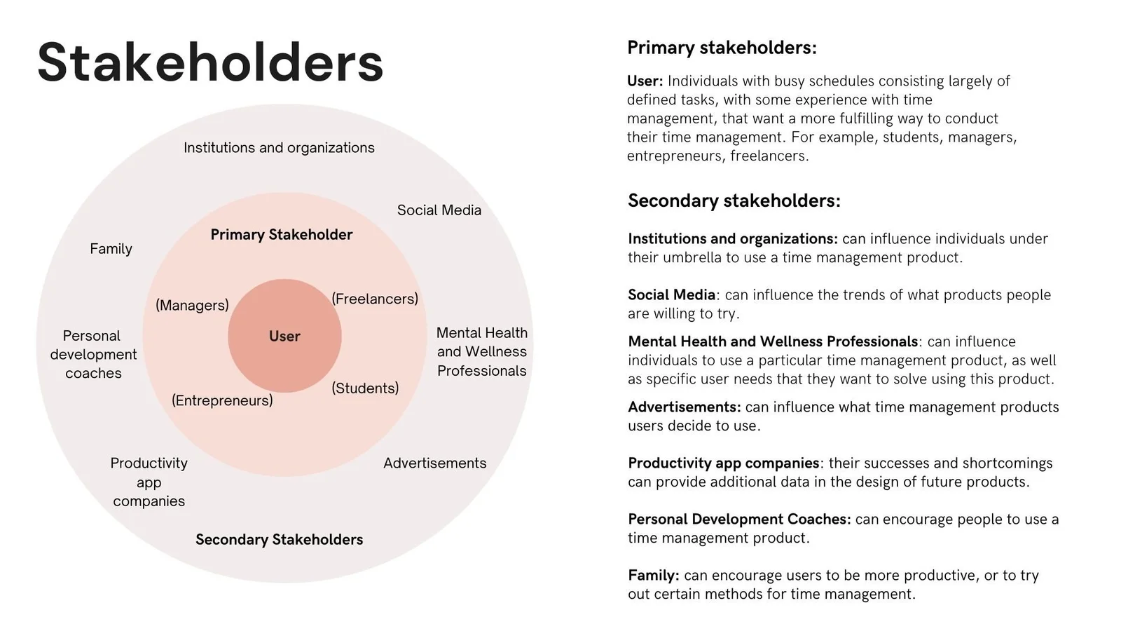
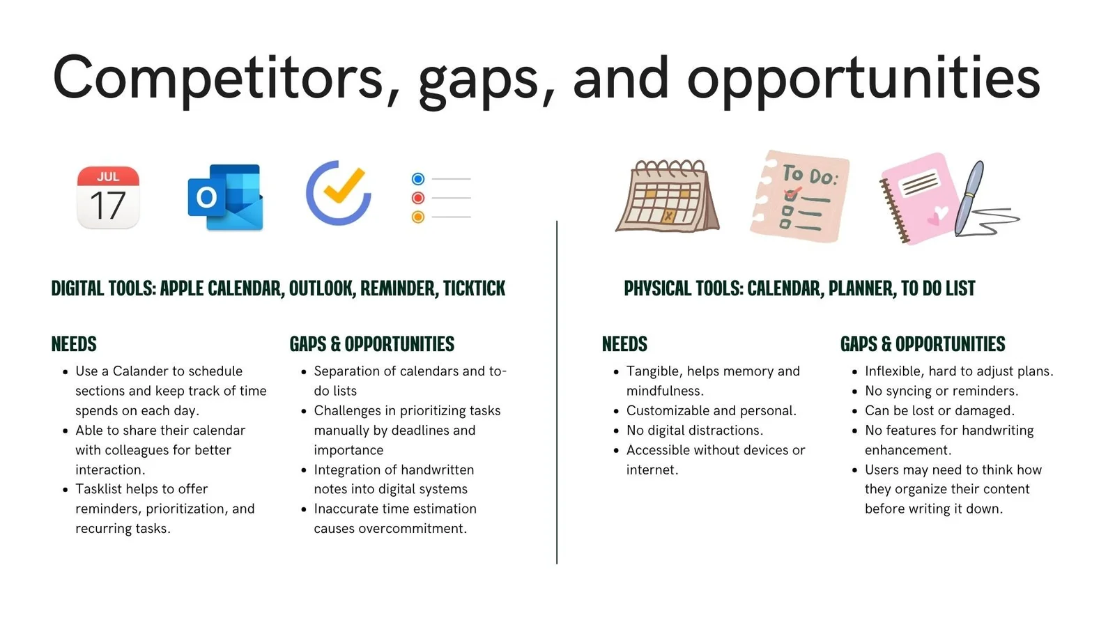
Mapped out A Stakeholder and Competitor analysis.
Competitive analysis of existing task/calendar management solutions.
Stakeholder identification and analysis to understand project requirements.
Problem Statement
“Help people who are currently managing tasks and activities more easily plan out their schedules using a task list and calendar combination so that they can successfully complete all the tasks they set out to complete, and feel happy and fulfilled in doing so.”
Define
The define user phase helped crystallize our understanding through:
Feasibility analysis balanced against user value propositions.
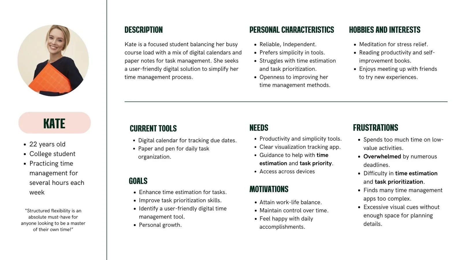
Creation of detailed user personas based on research findings.
Creation of to-be journey maps to visualize improved experiences.
Define the design solution features by using priority grid.
Persona representing what our user current needs, goals and Frustrations about.
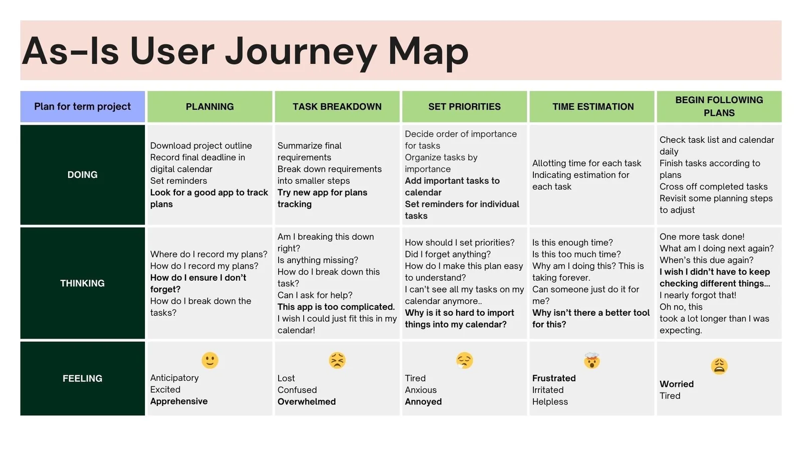
As-Is User Journey Map represent the initial stage when user takes in a process to accomplish their goal.
Ideation
During ideation, we focused on:
Setting clear feature prioritization frameworks.
Mapping the ideal user flow (Happy Path) for core tasks.
Creating low-fidelity wireframes to explore different interaction models.
Define Features for solution
We use Time limit ideation exercise to think about the design paths to explore on possibility features and functions to achieve the Apps usage.
Consider:
what are the features that should be prioritized, what will the user flow be for our app?
Chosen solution
Minimal effort: mirror the ease of recording tasks on a notebook by minimizing the number of actions needed for interfacing.
Everything at a glance: view both tasks and calendar events at once in a combined tool, eliminating the need for disparate tools.
Happiness and fulfillment: rewards the user with tangible, satisfying feedback when marking tasks as complete.
To-be User Journey Map represent the ideal stage when user takes in a process to accomplish their goal by using this app.
Low Fidelity Wireframes
We created the low fidelity wireframes to have a initial visualization about how our design path would be look like.
Visual Design
The final phase refined the visual aspects:
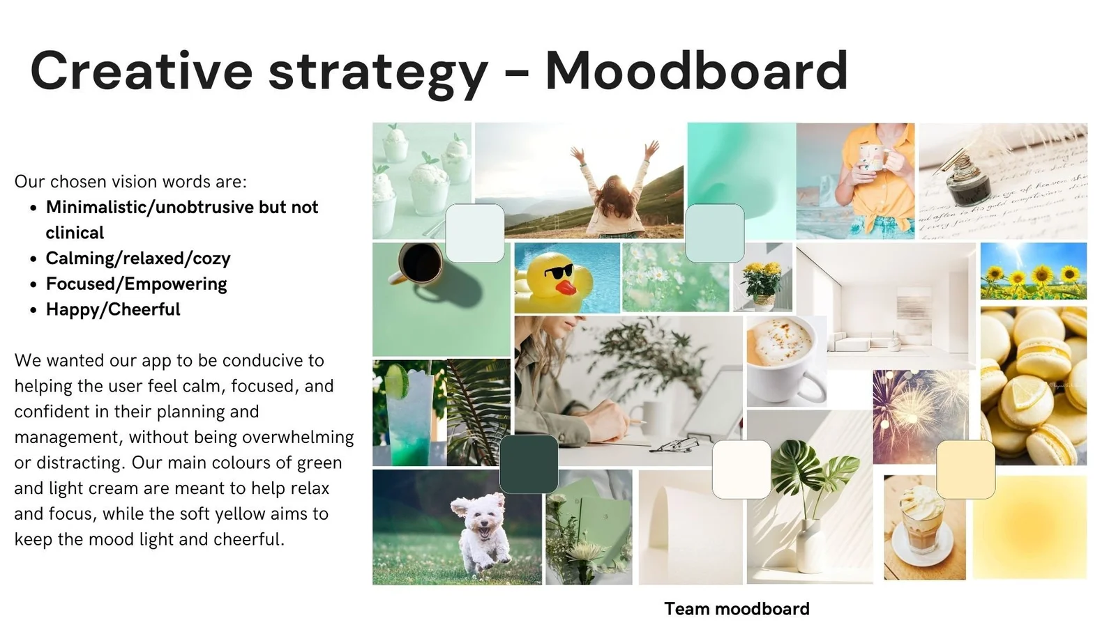
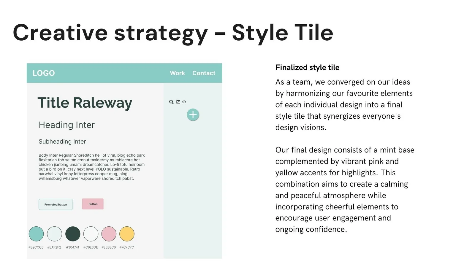
Creation of moodboards to define visual direction.
Development of Moodboard and style tile for consistent design language.
Iterative refinement of wireframes based on testing feedback.
Production of high-fidelity mockups for final design validation.
Solution storyboard
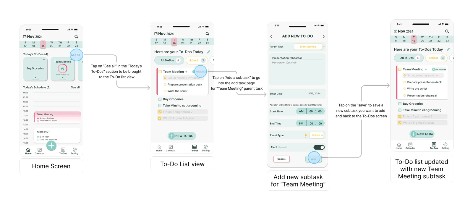
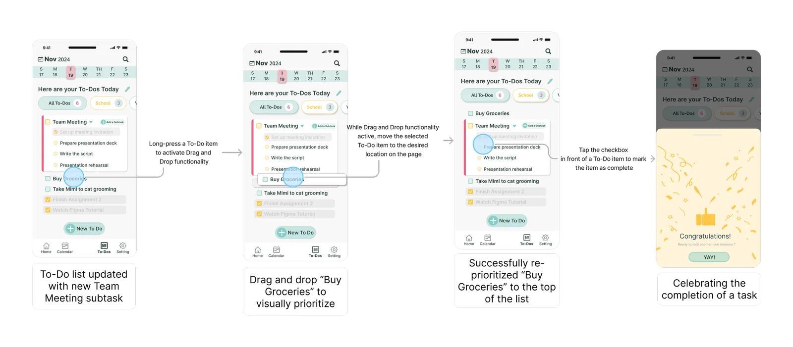
Happy path Prototype
Design + Test
This phase involved iterative design and validation:
Wireframe UI testing to validate basic interaction patterns.
Usability testing with 7 participants to gather feedback on core functionality.
Gether feedback and find out insights on the screen(what user really cares about) and improve our user path.
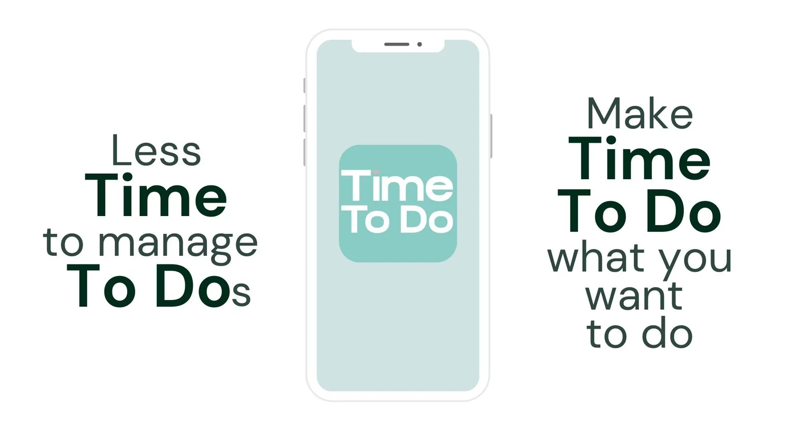
It’s time to try easier
time management :)
Reflection & Conclusion
The full UX design cycle taught me how to bridge theory into practice, especially during the tricky affinity diagram phase and limited time to achieve.
Our Success is from our weekly collaboration and always engaging in disscussion that helped us out of such challenges-which actually involved converging a great deal of ideas into cohesive logical design. Because of the constraint on time, only the very basic task creation/completion flow could be implemented, while we architected more complex features for further development.
This project provided me with hands-on experience with the whole UX process, from start to finish, while teaching me to balance features that were ideal and would work in reality.